Filters in General
Also: if some filters are unavailable in some instances (it is grayed-out), check the mode of the image. Use of filters can be subtle or quite extreme. Remember when we did our "optimization" during the first week? We utitlized "sharpen, unsharp mask". This was very subtle. Let's look at some more today. Whirlwind 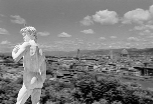
open and place david in florence
activate "david" and see if path exists there...check under "paths"in layers palette make selection, turn off path, copy activate "florence" and paste darken background and apply a filter to a general area
darken the background: menu bar, image, adjust, brightness/contrast lower the brightness apply a motion blur to background menu bar, filters, blur, motion blur, set at 10 remember, you can undo a filter completely...menu bar, edit, undo or simply lessen the effect of said filter...menu bar, filters, fade motion blur look at this dialogue box you can lessen the "opacity"of the effect or you can also utilize the now familar "blending modes" that we've seen here and there reapply the filter now: menu bar, filter, last filter is listed this will apply the filter the same way you did, no controllers using this convenient method apply a filter to only a selected area
draw an oval in the sky area menu bar, filter, distort, twirl look at dialogue box and set "angle" at 150 degrees hit ok edit, undo please note: when you're working with layers, make sure you know what layer is active before you strike! Tanstreet 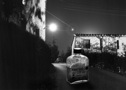
light carefully and play with scale
see if path exists on "tan" image make selection, turn off path, copy activate "levigne" and paste click on background in layers palette ("layers" tab instead of "paths") use dodge tool to darken area at base of bottle to "place it" on street Combo 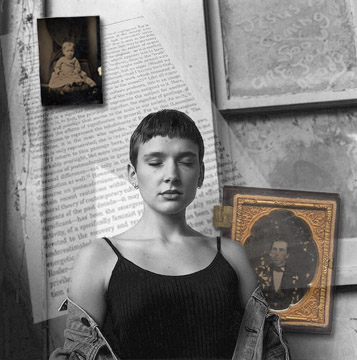
distortions
activate "text.jpg", select all, copy activate "portrait.jpg" and paste in the text transform the text by using "distort" make it go off in perspective duplicate layers
use the pen tool (i won't do all the work for you!) to make a path around the woman on the top layer make a selection and paste right back down on this image shuffle layers and layer opacity
now lower the opacity of the text layer look in the layers palette for the slider add bottles
make selection for one or other bottle, copy back to "portrait" and paste use transform to change it's size and place do the same with the second bottle add it to the composition as well Ripped 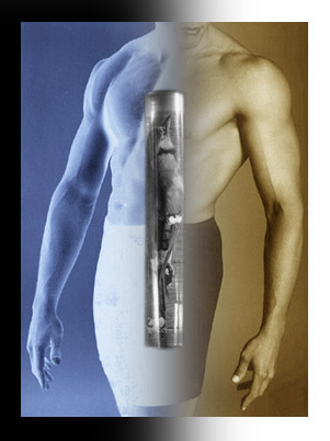 (canvas size, path selection, feathered selection, invert)
activate "ripped" menu bar, image, mode, rgb tool box, color picker, choose a warm color for foreground menu bar, edit, fill, soft light menu bar, image, canvas size, double the dimensions feathered selection
marquee tool, rectangle, feather selection 30 pixels remove half of this "ripped" body, going well up into the un-used portion of the frame delete this selection deselect click on background image menu bar, image, adjust, invert you can see that the colors are inverted as well as image being made into a negative crop to inlcude some the extra space as a border add a bird
open it and see if there is a path evident make a selection and add this to our "ripped" image flatten and save Autumn 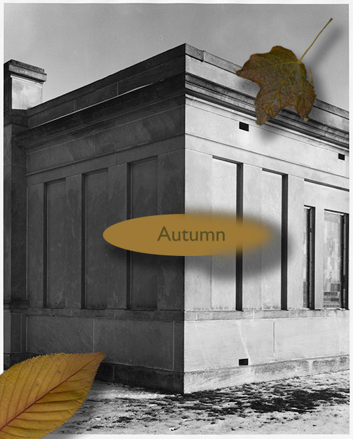 (scanning, mode, selection, graphic elements, fill, feathered selection, blur)
create a piece that uses the following...
scanned image graphic element text (more on this later) |
Next Page
Back to Index Page